
Change color theme
Build a useful dashboard
A dashboard brings related metrics into one view. Start with a question or meeting, then select the few numbers that help answer it. A useful dashboard explains its time period and gives readers enough context to interpret each chart.
Find a dashboard
Open Dashboards. Use Mine, Shared with you, and Organization to find the relevant collection. Use tags to narrow the collection. Select a dashboard's name to open it; use its star to keep it in Favorites.
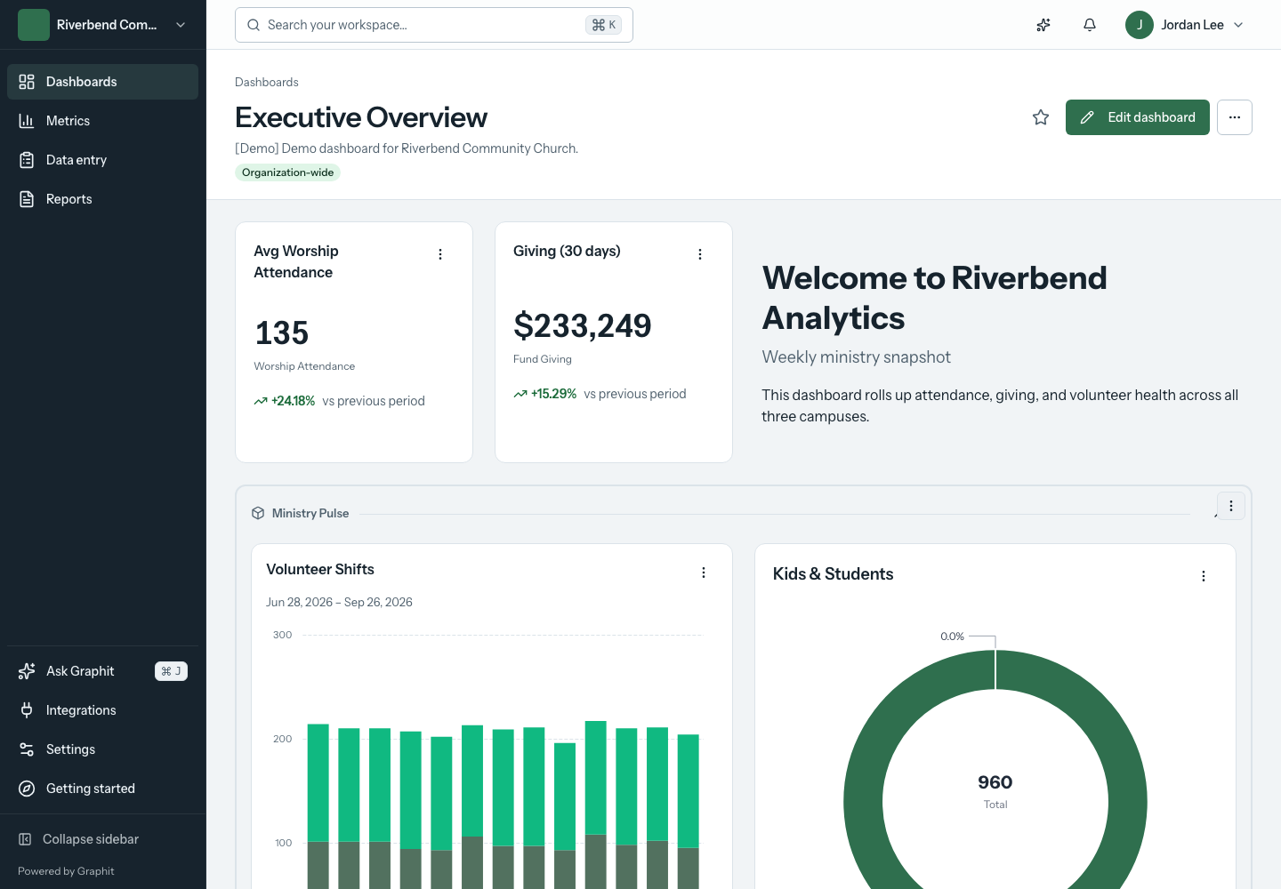
Create and arrange a dashboard
- Choose Create dashboard and enter its details.
- Open the dashboard and choose Edit dashboard.
- Use Add widget in the editing toolbar.
- Choose the widget type and configure its metric, period, and available options.
- Arrange and size widgets on the canvas.
- Choose Done editing to return to the reading view.
Editing controls sit above the canvas so they do not cover chart values. Check the resulting dashboard at both desktop and phone widths before sharing it.
Choose the right widget
Use a number tile for a single result, a trend chart for change over time, and a comparison chart when the relationship between categories matters. Text can explain a definition or decision; a report widget can place a compact report in the same workspace.
Avoid placing every available metric on one dashboard. Separate operational detail from a board or leadership overview, and keep related widgets together in sections where useful.
Show a chart as a table
Line, bar, and area widgets can show their values as a table instead. Set Show as to Table (one row per period). The table lists each period, newest first, with a column for each series and a Total when the series can be added together. Comparison and target series are left out of the table.
Show zero instead of no data
By default, a number widget shows “No data available” when the selected campus or period has no entries. Turn on Show 0 when there is no data when an absent entry really means zero, such as a ministry that did not meet. Its comparison is then treated as zero too. Leave it off when a missing entry could mean that nobody recorded the number.
Organize the dashboard into pages
Pages give one dashboard several focused views, such as Overview, Attendance, and Finance. While editing, choose Add page. Use Manage pages to name pages, change their order, or add another page, then choose Save pages.
New widgets belong to the page you are viewing. To move an existing widget, open its configuration and change Dashboard page. Moving a section moves its contents with it. Move or remove a page's widgets before deleting the page; a dashboard must keep at least one page.
Readers switch pages using the tabs above the canvas. The address updates for the selected page, so browser back and a copied page link can return to that view. Active dashboard filters stay in place when switching pages.
Dashboard managers can set Who can view this page to Everyone with dashboard access or Selected organization members. For a restricted page, select the allowed roles or members. The owner and administrators retain access. Restricted pages are excluded from public links and embeds.
Page restrictions control access to that dashboard page and its widgets. They do not change access to the underlying metrics elsewhere in Graphit, and they do not inherit Rock security-group permissions. Review those permissions separately before using a restricted page for confidential information. To hide a confidential number everywhere in Graphit, restrict the metric's audience as well.
Make the period explicit
A number such as “Attendance: 420” needs a period to be meaningful. Put the period in the widget title or use its configured period display. When comparisons or targets are enabled, leave enough room for the supporting text.
A percentage change is a comparison with the configured baseline. Check that baseline before interpreting it as growth or decline.
In the date-range controls, Last 13 months and Last 24 months include the current month through today plus the preceding 12 or 23 calendar months. This ministry year and Last ministry year use the organization's reporting calendar. A full ministry-year range can show future periods, which is useful for budgets.
Choose Recurring season for a period that repeats every year, such as a summer program. Set Season starts and Season ends. Graphit uses the latest season that has started; an end date before the start date continues into the following year. Use Custom dates for a one-time range.
Last month under Rolling period covers the previous full calendar month. To compare it with the whole month before, such as February with all of January, set a number widget's comparison to Previous month. Previous period compares with the same number of days just before the range instead.
Choose Last N days, weeks or months for a window that moves forward each day. Set Number of periods and Period. The window always ends today, so the current, partial period is included:
| Window | Covers |
|---|---|
| 30 Days | Today and the 29 days before it. |
| 14 Weeks | The last 98 days, not aligned to calendar weeks. |
| 6 Months | From the day after the same date six months ago. |
| 6 Months with Start on the 1st of the first month | From the first day of the month six months back, through today. |
Count only certain weekdays
Use Days to count on a chart or number widget to include only entries recorded on selected weekdays, such as Sunday check-ins in a weekend summary. All days are selected by default, and at least one must stay selected. The filter uses each entry's recorded date and applies to the comparison period as well.
Show categories over time
Choose Time and partition when a chart should show a separate series for each service time, fund, or other metric breakdown. Select the time interval and partition. Under Combined categories, enter a category name and select values to combine, such as several holiday service times. Values that you do not combine remain separate series.
Grouping by Partition Type alone shows one bar for each partition value. Combined categories works here too: for example, combine individual serving teams into broader volunteer types. Each value can belong to one category, and values you do not combine keep their own bars.
For stacked bars, the actual series stack together. Comparison and target series appear as lines over those bars, so a previous-year total does not add to the current-year stack.
Compare actuals with a changing budget
Use a separate metric for the budget, either ordinary budget measurements or an existing Rock Goal connection. See budget measurements. Select both the actual and budget metrics for the chart. Under Actuals and targets, mark each as Actual or Target. The budget can then vary by period instead of appearing as one flat target line.
Use Values over time to control how the chart treats those measurements:
| Control | When to use it |
|---|---|
| Show values as → Each period’s value | Show the result for each week, month, or other interval. |
| Show values as → Running total from range start | Accumulate additive values, such as giving or completion counts. Unique-person counts, averages, and latest-value snapshots cannot be added this way. |
| Periods without entries → Leave a gap | Distinguish missing data from a recorded zero. Use Show zero only when an absent entry should mean zero. |
| Future actual values → Hide future actuals, keep targets | Show the remaining budget without displaying actual values in future periods. |
| Assign entries to → Week ending Tuesday | Assign an entry to the next Tuesday, or keep it on Tuesday, before grouping. Other weekdays are available. This can move an entry into a different reporting month. |
Leave Assign entries to set to Their recorded date unless the source's reporting definition calls for a week-ending rule. These display calculations do not change the source entries. Check currency, campus mappings, date ranges, and the actual/budget definitions before comparing results.
Filter and inspect
If the dashboard has filters configured, the filter toolbar appears above the canvas. Choose a campus or available breakdown to narrow the view. Use Reset to return to the dashboard's defaults.
To let a chart filter the dashboard, edit a chart grouped by campus, partition, or time and partition. Turn on Use chart clicks to filter this dashboard, then save the widget. When a reader selects a category such as Missions, compatible charts, number tiles, and reports use that selection and an active-filter chip appears. Select the same category again or remove its chip to clear it. The category controls also work with a keyboard.
You can combine filters from different dimensions, such as campus and fund. Selecting another value within the same dimension replaces that selection. A combined category selects all the values assigned to it. Metrics without that partition remain unchanged, and unrelated fixed widget filters still apply. Public links and embeds cannot use these selections to expand a widget's published scope.
These selections do not save changes to the dashboard's definition. They follow you between pages of the current dashboard. On charts without click filtering enabled, legend controls continue to show or hide series. Use a widget's action menu for other available tools, including chart-data views.
Open a dashboard with filters already applied
The dashboard address records the campus and partition filters you select, so you can bookmark or share a filtered view. Choose the filters, then copy the address from your browser. Values that match the dashboard's defaults are left out of the address.
| Parameter | Accepts |
|---|---|
campus | A Graphit campus ID, the GUID of the linked Rock campus, or all to override a default campus. |
partition | A partition type ID and value ID separated by a colon, such as partition=12:48. Repeat the parameter for more than one partition type. |
For example, a link from a Rock page can open a dashboard for one campus by adding ?campus= and that campus's Rock GUID. An unknown campus shows all campuses. The same parameters work on public dashboard links, where they can only narrow what the link already shows.
Include a report
Add a report widget, choose its report, and set the number of displayed rows. The widget keeps the report's grouped rows, subtotals, and hierarchy. Dashboard campus and category selections apply to compatible report metrics, including the widget's Excel download. The displayed row limit keeps the widget compact; it does not replace the report's definition.
Use the report builder to change columns, ordered row groupings, calculations, and preview the complete result.
Add a live group directory
Choose Add widget → Group directory, select the Rock connection and Group types, and save the component to load its live data. The connected Rock plugin must support group directories. Respond to page filters makes the directory follow the selected campus.
Use Find a group to search the list and Refresh group directory to reload it. Each row shows the group, campus, leader total, and member total. Open a group to view its record in Rock, where Rock checks your access. A person in several groups can contribute to several membership or leadership totals; those totals are not a count of unique people across all groups.
To divide the list into sections, set Group rows by to Group type or Named categories of groups. For named categories, enter a Category name and the Rock group IDs that belong to it, separated by commas. A group can belong to one category. Groups outside your categories appear under Other unless you turn on Hide groups outside these categories. Each section heading shows its group count with leader and member subtotals.
Link to details or a Rock tool
In a widget's configuration, turn on Add a link below this widget and enter a Link label. Choose Another dashboard page for a link within the dashboard, or A report, Rock tool, or web page and enter its Web address.
For a Rock tool that accepts a campus parameter, enter its expected name in Campus query parameter (optional), such as CampusId, and choose a Campus value:
- Linked source campus ID passes the Rock campus ID. This is the default.
- Linked Rock campus GUID passes the Rock campus GUID, for Rock pages that expect a GUID.
- Graphit campus ID passes Graphit's identifier, for another Graphit page.
A linked value exists only for campuses matched to a Rock connection. Confirm the campus mapping and destination behavior before sharing the link.
Links open a destination; they do not run a workflow or attendance recalculation automatically. Rock still controls access to its tools and the actions available there.
Restricted widgets
A widget that uses a restricted metric shows a lock, Restricted, and “You don't have access to this data” to anyone outside that metric's audience. The widget's title and values are not loaded. The same placeholder appears on public links and embeds when the person who created them cannot see the metric. Dashboard page restrictions and metric audiences are separate controls; a person needs both to see a restricted widget's values.
Share the right view
Use the dashboard's action menu to review available sharing controls. Organization-wide access and public links serve different audiences. Check the displayed scope before sharing a link outside your team.
For a structured output with selected metrics and date grouping, use a report. To review or correct underlying values, open the metric.